
Interact with our Free Accounting.BI PowerBI Dashboards for Multiple Xero Organisations using informative video attached below.
Additionally, go through the article below;
Our article below provides a step-by-step breakdown guide on the Dashboards in clear and structured explanation.
This particular example explains that the Power.BI template is not only accessible in Power.BI desktop but also in the Power.BI service through shareable links or Power.BI axe.

So, how does this work?
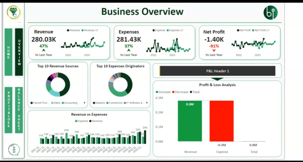
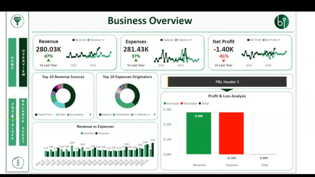
The Business Overview page is highlighted as a central component of the dashboards.
Most businesses will have a 'Business Overview page' that showcases the different binary features that can be built within the dashboards.
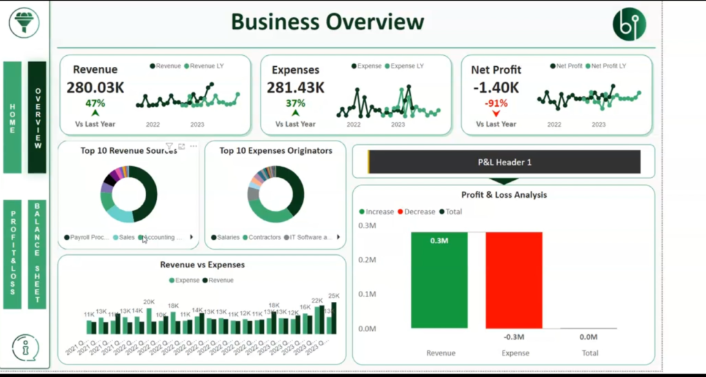
Click on the Filter Card feature, which is highlighted in yellow. This feature allows users to select different companies from the drop-down menu.
In this particular example, we've got two companies but it could be as many companies as you wish.
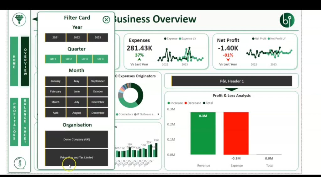
When a company is selected using the Filter Card, the data within the dashboard filters and changes to represent the selected company.
For instance we begin with the Demo Company(UK), which is of a black color, we'll see the data of the dashboard change just to represent that company.


The dashboard supports financial consolidation by incorporating data from multiple Xero entities. This allows us to analyze and compare data from different companies.
If we want to start incorporating the two companies' data, we start running financial consolidation with both Xero entities.
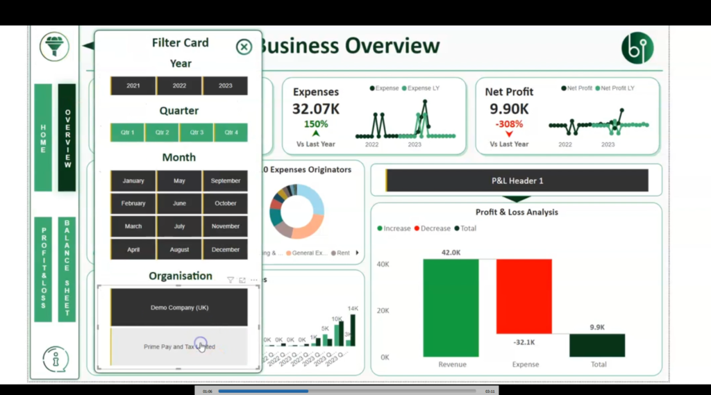
You can obviously do as many as you like, albeit the Power.BI dashboard may not handle unlimited.
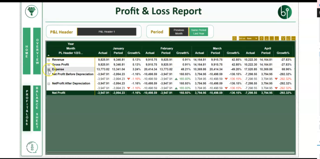
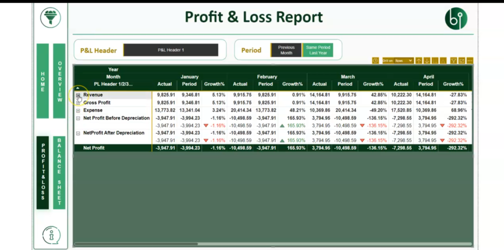
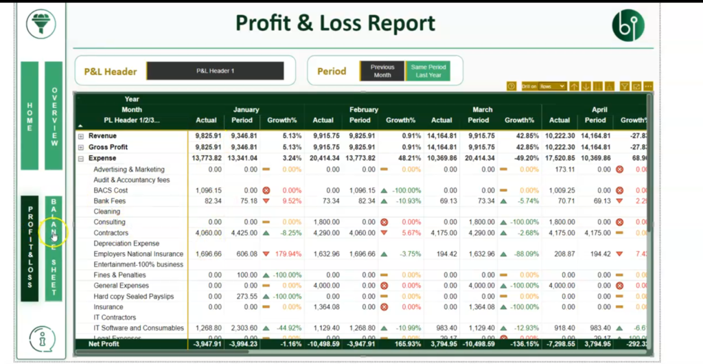
We also try to give Accounting.BI users, the idea on how they can start building their financial statements.

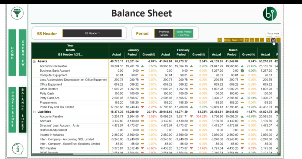
The dual-down functionality enables users to drill down into specific details within the Profit and Loss section. They show how expenses and revenue can be explored in more detail using this feature.

The data within the dashboards is entirely synchronous with Xero, ensuring real-time information.
To generate the list of data fetched, click on the icon highlighted in the diagram below,

So you can refresh the data, on-demand, timed intervals (e.g., every ten minutes, everyday and pretty much as you like (customized schedules). It's a truly real-time dashboard.
The upcoming features that we'll be releasing soon is how you can deal with printable reports and proper management accounting practices.
This particular example is designed to show you primarily a very basic dashboard on where you can start. Get a Power.BI developer either within our team or a third party Power.BI developer to start working on reports and develop something quite substantial for your organisation or accounting firm.
Don't hesitate to contact us for expert guidance and solutions.